Pantone 2019 Color of the Year: Meet Living Coral
Peachy pink with gold undertones, Living Coral is a fresh and vibrant color to add to your home in 2019. And for all you Mid-Century Modern fans like us, Living Coral is the perfect color to incorporate. It makes a statement without the strong contemporary vibe that red brings or the softer traditional feel of pink.
But that’s not to say that Living Coral will be a wall-flower hiding in the corner waiting to be discovered. Because of its bold nature, we recommend using this color as an accent rather than a foundation color. You’ll find this shade popping up all over your Pinterest feed in window treatments, upholstery, wallpaper and even tile.
Read on for our design tips.
1. Pairing with other colors
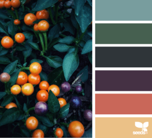
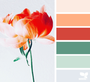
Whether you love a light, airy palette or dark, deep palette, Living Coral has the flexibility to go in either direction.
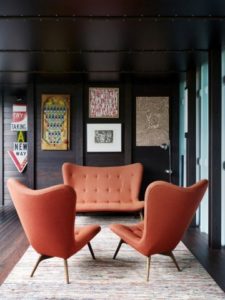
If you are feeling bold, pair Living Coral with a deep green. If you are looking to set the tone for a a more feminine environment, pair with blush and gold.
Color Palettes via Design Seeds | Photos via @ggiampagrimm & @on.the.rooftop
2. Sneak it in!
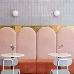
If I ever said to you “let’s use coral grout with grey tiles” what would you think? Probably that I am off my rocker, right?
So maybe you don’t take a leap quite as big as coral grout without a professional opinion but I encourage you to think outside the box when incorporating color.
3. Create statement spaces
For those of you want to go bold in your space, select a backdrop tone that will let Living Color do it’s ‘thang’…after all it did win color of the year, it deserves the stage for a minute.


